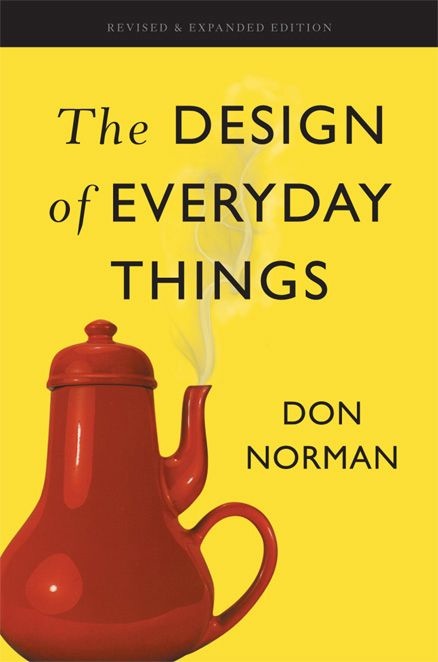
The Design of Everyday Things: Revised and Expanded Edition
About this book
The book introduces affordances, signifiers, mappings, constraints, feedback, and conceptual models. Together they describe how an object communicates possible actions and whether the result of an action is visible enough for a person to learn what happened.
Norman distinguishes slips—when execution goes wrong despite a correct goal—from mistakes based on an incorrect understanding. That difference matters because each requires a different design response, and blame often prevents the system from being improved.
Examples range from doors and stoves to complex technology, showing how human-centred design observes real behaviour, prototypes, tests, and iterates. Good design accommodates limited attention and imperfect memory instead of treating them as exceptional defects.
The Design of Everyday Things is the revised and expanded edition of Norman’s influential introduction. Some technologies have changed since its examples were chosen, but the principles remain useful for diagnosing why an interaction feels obvious only to its maker.
Read a sample
5,015 words
Plain text
From the opening
CHAPTER ONE
THE PSYCHOPATHOLOGY OF EVERYDAY THINGS
If I were placed in the cockpit of a modern jet airliner, my inability to perform well would neither surprise nor bother me. But why should I have trouble with doors and light switches, water faucets and stoves? “Doors?” I can hear the reader saying. “You have trouble opening doors?” Yes. I push doors that are meant to be pulled, pull doors that should be pushed, and walk into doors that neither pull nor push, but slide. Moreover, I see others having the same troubles—unnecessary troubles. My problems with doors have become so well known that confusing doors are often called “Norman doors.” Imagine becoming famous for doors that don’t work right. I’m pretty sure that’s not what my parents planned for me. (Put “Norman doors” into your favorite search engine—be sure to include the quote marks: it makes for fascinating reading.)
How can such a simple thing as a door be so confusing? A door would seem to be about as simple a device as possible. There is not much you can do to a door: you can open it or shut it. Suppose you are in an office building, walking down a corridor. You come to a door. How does it open? Should you push or pull, on the left or the right? Maybe the door slides. If so, in which direction? I have seen doors that slide to the left, to the right, and even up into the ceiling. The design of the door should indicate how to work it without any need for signs, certainly without any need for trial and error.
FIGURE 1.1. Coffeepot for Masochists. The French artist Jacques Carelman in his series of books Catalogue d’objets introuvables (Catalog of unfindable objects) provides delightful examples of everyday things that are deliberately unworkable, outrageous, or otherwise ill-formed. One of my favorite items is what he calls “coffeepot for masochists.” The photograph shows a copy given to me by collegues at the University of California, San Diego. It is one of my treasured art objects. (Photograph by Aymin Shamma for the author.)
A friend told me of the time he got trapped in the doorway of a post office in a European city. The entrance was an imposing row of six glass swinging doors, followed immediately by a second, identical row. That’s a standard design: it helps reduce the airflow and thus maintain the indoor temperature of the building. There was no visible hardware: obviously the doors could swing in either direction: all a person had to do was push the side of the door and enter.
My friend pushed on one of the outer doors. It swung inward, and he entered the building. Then, before he could get to the next row of doors, he was distracted and turned around for an instant. He didn’t realize it at the time, but he had moved slightly to the right. So when he came to the next door and pushed it, nothing happened. “Hmm,” he thought, “must be locked.” So he pushed the side of the adjacent door. Nothing. Puzzled, my friend decided to go outside again. He turned around and pushed against the side of a door. Nothing. He pushed the adjacent door. Nothing. The door he had just entered no longer worked. He turned around once more and tried the inside doors again. Nothing. Concern, then mild panic. He was trapped! Just then, a group of people on the other side of the entranceway (to my friend’s right) passed easily through both sets of doors. My friend hurried over to follow their path.
How could such a thing happen? A swinging door has two sides. One contains the supporting pillar and the hinge, the other is unsupported. To open the door, you must push or pull on the unsupported edge. If you push on the hinge side, nothing happens. In my friend’s case, he was in a building where the designer aimed for beauty, not utility. No distracting lines, no visible pillars, no visible hinges. So how can the ordinary user know which side to push on? While distracted, my friend had moved toward the (invisible) supporting pillar, so he was pushing the doors on the hinged side. No wonder nothing happened. Attractive doors. Stylish. Probably won a design prize.
Two of the most important characteristics of good design are discoverability and understanding. Discoverability: Is it possible to even figure out what actions are possible and where and how to perform them? Understanding: What does it all mean? How is the product supposed to be used? What do all the different controls and settings mean?
The doors in the story illustrate what happens when discoverability fails. Whether the device is a door or a stove, a mobile phone or a nuclear power plant, the relevant components must be visible, and they must communicate the correct message: What actions are possible? Where and how should they be done? With doors that push, the designer must provide signals that naturally indicate where to push. These need not destroy the aesthetics. Put a vertical plate on the side to be pushed. Or make the supporting pillars visible. The vertical plate and supporting pillars are natural signals, naturally interpreted, making it easy to know just what to do: no labels needed.
With complex devices, discoverability and understanding require the aid of manuals or personal instruction. We accept this if the device is indeed complex, but it should be unnecessary for simple things. Many products defy understanding simply because they have too many functions and controls. I don’t think that simple home appliances—stoves, washing machines, audio and television sets—should look like Hollywood’s idea of a spaceship control room. They already do, much to our consternation. Faced with a bewildering array of controls and displays, we simply memorize one or two fixed settings to approximate what is desired.
Continue reading the sampleClose the sample
In England I visited a home with a fancy new Italian washer-dryer combination, with super-duper multisymbol controls, all to do everything anyone could imagine doing with the washing and drying of clothes. The husband (an engineering psychologist) said he refused to go near it. The wife (a physician) said she had simply memorized one setting and tried to ignore the rest. I asked to see the manual: it was just as confusing as the device. The whole purpose of the design is lost.
The Complexity of Modern Devices
All artificial things are designed. Whether it is the layout of furniture in a room, the paths through a garden or forest, or the intricacies of an electronic device, some person or group of people had to decide upon the layout, operation, and mechanisms. Not all designed things involve physical structures. Services, lectures, rules and procedures, and the organizational structures of businesses and governments do not have physical mechanisms, but their rules of operation have to be designed, sometimes informally, sometimes precisely recorded and specified.
But even though people have designed things since prehistoric times, the field of design is relatively new, divided into many areas of specialty. Because everything is designed, the number of areas is enormous, ranging from clothes and furniture to complex control rooms and bridges. This book covers everyday things, focusing on the interplay between technology and people to ensure that the products actually fulfill human needs while being understandable and usable. In the best of cases, the products should also be delightful and enjoyable, which means that not only must the requirements of engineering, manufacturing, and ergonomics be satisfied, but attention must be paid to the entire experience, which means the aesthetics of form and the quality of interaction. The major areas of design relevant to this book are industrial design, interaction design, and experience design. None of the fields is well defined, but the focus of the efforts does vary, with industrial designers emphasizing form and material, interactive designers emphasizing understandability and usability, and experience designers emphasizing the emotional impact. Thus:
Industrial design: The professional service of creating and developing concepts and specifications that optimize the function, value, and appearance of products and systems for the mutual benefit of both user and manufacturer (from the Industrial Design Society of America’s website).
Interaction design: The focus is upon how people interact with technology. The goal is to enhance people’s understanding of what can be done, what is happening, and what has just occurred. Interaction design draws upon principles of psychology, design, art, and emotion to ensure a positive, enjoyable experience.
Experience design: The practice of designing products, processes, services, events, and environments with a focus placed on the quality and enjoyment of the total experience.
Design is concerned with how things work, how they are controlled, and the nature of the interaction between people and technology. When done well, the results are brilliant, pleasurable products. When done badly, the products are unusable, leading to great frustration and irritation. Or they might be usable, but force us to behave the way the product wishes rather than as we wish.
Machines, after all, are conceived, designed, and constructed by people. By human standards, machines are pretty limited. They do not maintain the same kind of rich history of experiences that people have in common with one another, experiences that enable us to interact with others because of this shared understanding. Instead, machines usually follow rather simple, rigid rules of behavior. If we get the rules wrong even slightly, the machine does what it is told, no matter how insensible and illogical. People are imaginative and creative, filled with common sense; that is, a lot of valuable knowledge built up over years of experience. But instead of capitalizing on these strengths, machines require us to be precise and accurate, things we are not very good at. Machines have no leeway or common sense. Moreover, many of the rules followed by a machine are known only by the machine and its designers.
When people fail to follow these bizarre, secret rules, and the machine does the wrong thing, its operators are blamed for not understanding the machine, for not following its rigid specifications. With everyday objects, the result is frustration. With complex devices and commercial and industrial processes, the resulting difficulties can lead to accidents, injuries, and even deaths. It is time to reverse the situation: to cast the blame upon the machines and their design. It is the machine and its design that are at fault. It is the duty of machines and those who design them to understand people. It is not our duty to understand the arbitrary, meaningless dictates of machines.
The reasons for the deficiencies in human-machine interaction are numerous. Some come from the limitations of today’s technology. Some come from self-imposed restrictions by the designers, often to hold down cost. But most of the problems come from a complete lack of understanding of the design principles necessary for effective human-machine interaction. Why this deficiency? Because much of the design is done by engineers who are experts in technology but limited in their understanding of people. “We are people ourselves,” they think, “so we understand people.” But in fact, we humans are amazingly complex. Those who have not studied human behavior often think it is pretty simple. Engineers, moreover, make the mistake of thinking that logical explanation is sufficient: “If only people would read the instructions,” they say, “everything would be all right.”
Engineers are trained to think logically. As a result, they come to believe that all people must think this way, and they design their machines accordingly. When people have trouble, the engineers are upset, but often for the wrong reason. “What are these people doing?” they will wonder. “Why are they doing that?” The problem with the designs of most engineers is that they are too logical. We have to accept human behavior the way it is, not the way we would wish it to be.
I used to be an engineer, focused upon technical requirements, quite ignorant of people. Even after I switched into psychology and cognitive science, I still maintained my engineering emphasis upon logic and mechanism. It took a long time for me to realize that my understanding of human behavior was relevant to my interest in the design of technology. As I watched people struggle with technology, it became clear that the difficulties were caused by the technology, not the people.
I was called upon to help analyze the American nuclear power plant accident at Three Mile Island (the island name comes from the fact that it is located on a river, three miles south of Middle-town in the state of Pennsylvania). In this incident, a rather simple mechanical failure was misdiagnosed. This led to several days of difficulties and confusion, total destruction of the reactor, and a very close call to a severe radiation release, all of which brought the American nuclear power industry to a complete halt. The operators were blamed for these failures: “human error” was the immediate analysis. But the committee I was on discovered that the plant’s control rooms were so poorly designed that error was inevitable: design was at fault, not the operators. The moral was simple: we were designing things for people, so we needed to understand both technology and people. But that’s a difficult step for many engineers: machines are so logical, so orderly. If we didn’t have people, everything would work so much better. Yup, that’s how I used to think.
My work with that committee changed my view of design. Today, I realize that design presents a fascinating interplay of technology and psychology, that the designers must understand both. Engineers still tend to believe in logic. They often explain to me in great, logical detail, why their designs are good, powerful, and wonderful. “Why are people having problems?” they wonder. “You are being too logical,” I say. “You are designing for people the way you would like them to be, not for the way they really are.”
When the engineers object, I ask whether they have ever made an error, perhaps turning on or off the wrong light, or the wrong stove burner. “Oh yes,” they say, “but those were errors.” That’s the point: even experts make errors. So we must design our machines on the assumption that people will make errors. (Chapter 5 provides a detailed analysis of human error.)
Human-Centered Design
People are frustrated with everyday things. From the ever-increasing complexity of the automobile dashboard, to the increasing automation in the home with its internal networks, complex music, video, and game systems for entertainment and communication, and the increasing automation in the kitchen, everyday life sometimes seems like a never-ending fight against confusion, continued errors, frustration, and a continual cycle of updating and maintaining our belongings.
In the multiple decades that have elapsed since the first edition of this book was published, design has gotten better. There are now many books and courses on the topic. But even though much has improved, the rapid rate of technology change outpaces the advances in design. New technologies, new applications, and new methods of interaction are continually arising and evolving. New industries spring up. Each new development seems to repeat the mistakes of the earlier ones; each new field requires time before it, too, adopts the principles of good design. And each new invention of technology or interaction technique requires experimentation and study before the principles of good design can be fully integrated into practice. So, yes, things are getting better, but as a result, the challenges are ever present.
The solution is human-centered design (HCD), an approach that puts human needs, capabilities, and behavior first, then designs to accommodate those needs, capabilities, and ways of behaving. Good design starts with an understanding of psychology and technology. Good design requires good communication, especially from machine to person, indicating what actions are possible, what is happening, and what is about to happen. Communication is especially important when things go wrong. It is relatively easy to design things that work smoothly and harmoniously as long as things go right. But as soon as there is a problem or a misunderstanding, the problems arise. This is where good design is essential. Designers need to focus their attention on the cases where things go wrong, not just on when things work as planned. Actually, this is where the most satisfaction can arise: when something goes wrong but the machine highlights the problems, then the person understands the issue, takes the proper actions, and the problem is solved. When this happens smoothly, the collaboration of person and device feels wonderful.
TABLE 1.1. The Role of HCD and Design Specializations
Experience design
These are areas of focus
Industrial design
Interaction design
Human-centered design
The process that ensures that the designs match the needs and capabilities of the people for whom they are intended
Human-centered design is a design philosophy. It means starting with a good understanding of people and the needs that the design is intended to meet. This understanding comes about primarily through observation, for people themselves are often unaware of their true needs, even unaware of the difficulties they are encountering. Getting the specification of the thing to be defined is one of the most difficult parts of the design, so much so that the HCD principle is to avoid specifying the problem as long as possible but instead to iterate upon repeated approximations. This is done through rapid tests of ideas, and after each test modifying the approach and the problem definition. The results can be products that truly meet the needs of people. Doing HCD within the rigid time, budget, and other constraints of industry can be a challenge: Chapter 6 examines these issues.
Where does HCD fit into the earlier discussion of the several different forms of design, especially the areas called industrial, interaction, and experience design? These are all compatible. HCD is a philosophy and a set of procedures, whereas the others are areas of focus (see Table 1.1). The philosophy and procedures of HCD add deep consideration and study of human needs to the design process, whatever the product or service, whatever the major focus.
Fundamental Principles of Interaction
Great designers produce pleasurable experiences. Experience: note the word. Engineers tend not to like it; it is too subjective. But when I ask them about their favorite automobile or test equipment, they will smile delightedly as they discuss the fit and finish, the sensation of power during acceleration, their ease of control while shifting or steering, or the wonderful feel of the knobs and switches on the instrument. Those are experiences.
Experience is critical, for it determines how fondly people remember their interactions. Was the overall experience positive, or was it frustrating and confusing? When our home technology behaves in an uninterpretable fashion we can become confused, frustrated, and even angry—all strong negative emotions. When there is understanding it can lead to a feeling of control, of mastery, and of satisfaction or even pride—all strong positive emotions. Cognition and emotion are tightly intertwined, which means that the designers must design with both in mind.
When we interact with a product, we need to figure out how to work it. This means discovering what it does, how it works, and what operations are possible: discoverability. Discoverability results from appropriate application of five fundamental psychological concepts covered in the next few chapters: affordances, signifiers, constraints, mappings, and feedback. But there is a sixth principle, perhaps most important of all: the conceptual model of the system. It is the conceptual model that provides true understanding. So I now turn to these fundamental principles, starting with affordances, signifiers, mappings, and feedback, then moving to conceptual models. Constraints are covered in Chapters 3 and 4.
AFFORDANCES
We live in a world filled with objects, many natural, the rest artificial. Every day we encounter thousands of objects, many of them new to us. Many of the new objects are similar to ones we already know, but many are unique, yet we manage quite well. How do we do this? Why is it that when we encounter many unusual natural objects, we know how to interact with them? Why is this true with many of the artificial, human-made objects we encounter? The answer lies with a few basic principles. Some of the most important of these principles come from a consideration of affordances.
The term affordance refers to the relationship between a physical object and a person (or for that matter, any interacting agent, whether animal or human, or even machines and robots). An affordance is a relationship between the properties of an object and the capabilities of the agent that determine just how the object could possibly be used. A chair affords (“is for”) support and, therefore, affords sitting. Most chairs can also be carried by a single person (they afford lifting), but some can only be lifted by a strong person or by a team of people. If young or relatively weak people cannot lift a chair, then for these people, the chair does not have that affordance, it does not afford lifting.
The presence of an affordance is jointly determined by the qualities of the object and the abilities of the agent that is interacting. This relational definition of affordance gives considerable difficulty to many people. We are used to thinking that properties are associated with objects. But affordance is not a property. An affordance is a relationship. Whether an affordance exists depends upon the properties of both the object and the agent.
Glass affords transparency. At the same time, its physical structure blocks the passage of most physical objects. As a result, glass affords seeing through and support, but not the passage of air or most physical objects (atomic particles can pass through glass). The blockage of passage can be considered an anti-affordance—the prevention of interaction. To be effective, affordances and anti-affordances have to be discoverable—perceivable. This poses a difficulty with glass. The reason we like glass is its relative invisibility, but this aspect, so useful in the normal window, also hides its anti-affordance property of blocking passage. As a result, birds often try to fly through windows. And every year, numerous people injure themselves when they walk (or run) through closed glass doors or large picture windows. If an affordance or anti-affordance cannot be perceived, some means of signaling its presence is required: I call this property a signifier (discussed in the next section).
The notion of affordance and the insights it provides originated with J. J. Gibson, an eminent psychologist who provided many advances to our understanding of human perception. I had interacted with him over many years, sometimes in formal conferences and seminars, but most fruitfully over many bottles of beer, late at night, just talking. We disagreed about almost everything. I was an engineer who became a cognitive psychologist, trying to understand how the mind works. He started off as a Gestalt psychologist, but then developed an approach that is today named after him: Gibsonian psychology, an ecological approach to perception. He argued that the world contained the clues and that people simply picked them up through “direct perception.” I argued that nothing could be direct: the brain had to process the information arriving at the sense organs to put together a coherent interpretation. “Nonsense,” he loudly proclaimed; “it requires no interpretation: it is directly perceived.” And then he would put his hand to his ears, and with a triumphant flourish, turn off his hearing aids: my counterarguments would fall upon deaf ears—literally.
When I pondered my question—how do people know how to act when confronted with a novel situation—I realized that a large part of the answer lay in Gibson’s work. He pointed out that all the senses work together, that we pick up information about the world by the combined result of all of them. “Information pickup” was one of his favorite phrases, and Gibson believed that the combined information picked up by all of our sensory apparatus—sight, sound, smell, touch, balance, kinesthetic, acceleration, body position— determines our perceptions without the need for internal processing or cognition. Although he and I disagreed about the role played by the brain’s internal processing, his brilliance was in focusing attention on the rich amount of information present in the world. Moreover, the physical objects conveyed important information about how people could interact with them, a property he named “affordance.”
Affordances exist even if they are not visible. For designers, their visibility is critical: visible affordances provide strong clues to the operations of things. A flat plate mounted on a door affords pushing. Knobs afford turning, pushing, and pulling. Slots are for inserting things into. Balls are for throwing or bouncing. Perceived affordances help people figure out what actions are possible without the need for labels or instructions. I call the signaling component of affordances signifiers.
SIGNIFIERS
Are affordances important to designers? The first edition of this book introduced the term affordances to the world of design. The design community loved the concept and affordances soon propagated into the instruction and writing about design. I soon found mention of the term everywhere. Alas, the term became used in ways that had nothing to do with the original.
Many people find affordances difficult to understand because they are relationships, not properties. Designers deal with fixed properties, so there is a temptation to say that the property is an affordance. But that is not the only problem with the concept of affordances.
Designers have practical problems. They need to know how to design things to make them understandable. They soon discovered that when working with the graphical designs for electronic displays, they needed a way to designate which parts could be touched, slid upward, downward, or sideways, or tapped upon. The actions could be done with a mouse, stylus, or fingers. Some systems responded to body motions, gestures, and spoken words, with no touching of any physical device. How could designers describe what they were doing? There was no word that fit, so they took the closest existing word—affordance. Soon designers were saying such things as, “I put an affordance there,” to describe why they displayed a circle on a screen to indicate where the person should touch, whether by mouse or by finger. “No,” I said, “that is not an affordance. That is a way of communicating where the touch should be. You are communicating where to do the touching: the affordance of touching exists on the entire screen: you are trying to signify where the touch should take place. That’s not the same thing as saying what action is possible.”
Not only did my explanation fail to satisfy the design community, but I myself was unhappy. Eventually I gave up: designers needed a word to describe what they were doing, so they chose affordance. What alternative did they have? I decided to provide a better answer: signifiers. Affordances determine what actions are possible. Signifiers communicate where the action should take place. We need both.
People need some way of understanding the product or service they wish to use, some sign of what it is for, what is happening, and what the alternative actions are. People search for clues, for any sign that might help them cope and understand. It is the sign that is important, anything that might signify meaningful information. Designers need to provide these clues. What people need, and what designers must provide, are signifiers. Good design requires, among other things, good communication of the purpose, structure, and operation of the device to the people who use it. That is the role of the signifier.
The term signifier has had a long and illustrious career in the exotic field of semiotics, the study of signs and symbols. But just as I appropriated affordance to use in design in a manner somewhat different than its inventor had intended, I use signifier in a somewhat different way than it is used in semiotics. For me, the term signifier refers to any mark or sound, any perceivable indicator that communicates appropriate behavior to a person.
Signifiers can be deliberate and intentional, such as the sign PUSH on a door, but they may also be accidental and unintentional, such as our use of the visible trail made by previous people walking through a field or over a snow-covered terrain to determine the best path. Or how we might use the presence or absence of people waiting at a train station to determine whether we have missed the train. (I explain these ideas in more detail in my book Living with Complexity.)
FIGURE 1.2. Problem Doors: Signifiers Are Needed. Door hardware can signal whether to push or pull without signs, but the hardware of the two doors in the upper photo, A, are identical even though one should be pushed, the other pulled. The flat, ribbed horizontal bar has the obvious perceived affordance of pushing, but as the signs indicate, the door on the left is to be pulled, the one on the right is to be pushed. In the bottom pair of photos, B and C, there are no visible signifiers or affordances. How does one know which side to push? Trial and error. When external signifiers—signs— have to be added to something as simple as a door, it indicates bad design. (Photographs by the author.)
The signifier is an important communication device to the recipient, whether or not communication was intended. It doesn’t matter whether the useful signal was deliberately placed or whether it is incidental: there is no necessary distinction. Why should it matter whether a flag was placed as a deliberate clue to wind direction (as is done at airports or on the masts of sailboats) or was there as an advertisement or symbol of pride in one’s country (as is done on public buildings). Once I interpret a flag’s motion to indicate wind direction, it does not matter why it was placed there.